Breakout
When you need to break out of a grid layout.
The <Breakout> component is designed to help elements break out of their current container layout, creating visual interest and giving content the space it needs to stand out. Combine <Breakout> with the <Container> component to maintain a cohesive design while effectively drawing attention to important elements.
Usage
Use the <Breakout> component when you need elements to break out of their current container layout, adding visual interest and giving content the space it needs to stand out.
It is particularly useful for situations where extra emphasis is needed or when you want to create a more dynamic and engaging reading experience. <Breakout> is ideal for highlighting media elements or other key content.
Welcome to The Giggle Grounds - Laughville's New Comedy Hub!

import { Aspect, Breakout, Container, Headline, Text,} from '@marigold/components';export default () => ( <Container align="center" alignItems="center" space={4}> <Headline level="3"> Welcome to The Giggle Grounds - Laughville's New Comedy Hub! </Headline> <Breakout> <Aspect ratio="ultrawide"> <img src="/venues/comedy-show.webp" alt="" /> </Aspect> </Breakout> <Text> Laughville, get ready to laugh! Introducing The Giggle Grounds, an outdoor amphitheater for comedy under the stars. Located at 123 Main Street, this venue blends natural charm with live entertainment for a perfect night out. With a capacity of 500, The Giggle Grounds offers an intimate yet lively experience, ideal for enjoying top comedians in an open-air setting. Pricing ranges from $1000 to $5000, making it flexible for various events and budgets. Join us at The Giggle Grounds for an unforgettable comedy experience! For bookings or more information, visit us at 123 Main Street, Laughville. </Text> </Container>);Complex layouts
You can create more complex layouts within the <Breakout> component by combining it with other layout components. By nesting <Inline>, <Stack>, or <Columns> inside <Breakout>, you can design advanced, responsive structures that go beyond simple content.
Note that the <Text> component will still adhere to the content length defined by the <Container>.
Upcoming Shows at The Guffaw Gardens
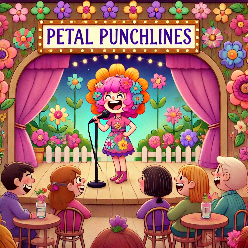
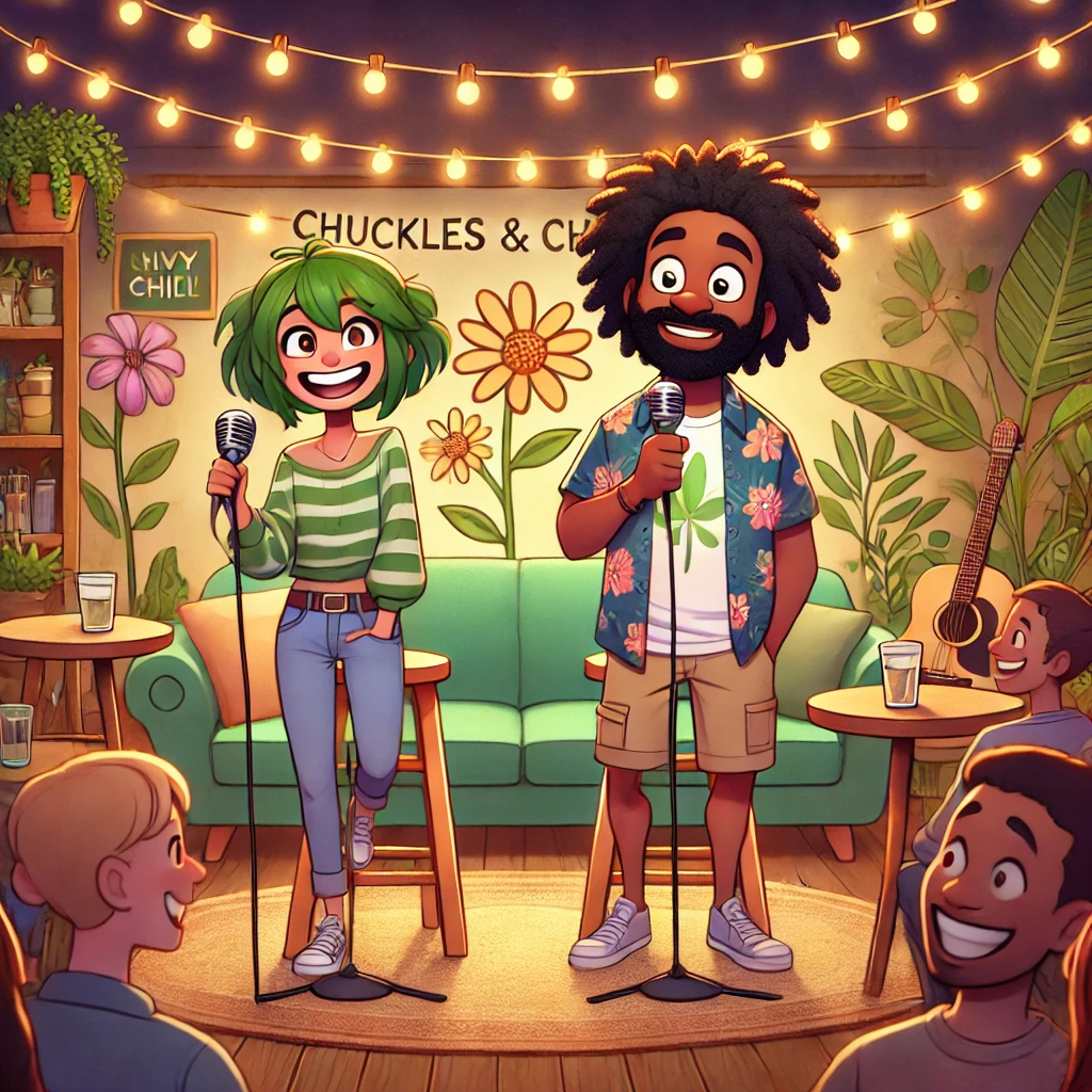
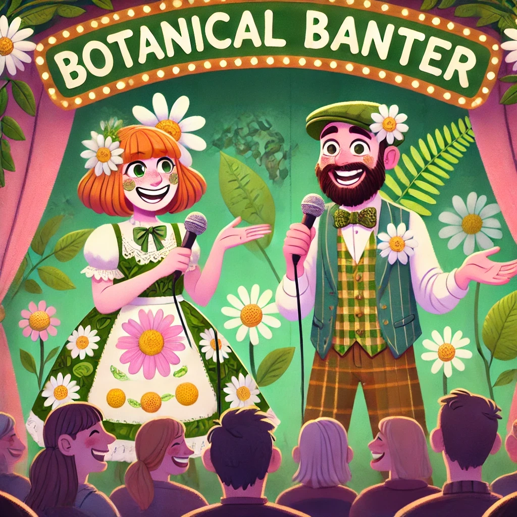
import { Aspect, Breakout, Container, Headline, Inline, Text,} from '@marigold/components';export default () => ( <Container space={6} align="center"> <Headline level="2">Upcoming Shows at The Guffaw Gardens</Headline> <Breakout> <Inline space={4} alignY="center" alignX="center"> <Aspect maxWidth="200px"> <img src="/venues/petal-punchlines.webp" alt="" /> </Aspect> <Aspect maxWidth="200px"> <img src="/venues/chuckles-and-chill.webp" alt="" /> </Aspect> <Aspect maxWidth="200px"> <img src="/venues/botanical-banter.webp" alt="" /> </Aspect> </Inline> </Breakout> <Text> Get ready for a season of laughter at The Guffaw Gardens! This spring, don't miss the Laugh Bloom Festival, featuring some of the best names in comedy. </Text> <Text> On May 5th, The Petal Punchlines will be hosted by comedian Rosie Petals, known for her sharp wit. On May 12th, Chuckles & Chill will bring a relaxed evening of comedy with Ivy Green and Marv "The Bloom" Thompson. Finish the month with Botanical Banter on May 26th, headlined by Daisy Bloom and Fern Tickles, promising a night full of laughs. </Text> <Text> Whether with friends or for a special night out, The Guffaw Gardens is the place to be for comedy and nature this season. </Text> </Container>);Props
Breakout
Prop
Type
Accessibility props (6)
Prop
Type