Feedback Messages
Learn when to use which message.
Messages are feedback mechanisms that inform users about important events, actions, conditions, or information within the application.
Appropriate communication of system status is critical to building trust with users, and is Jakob Nielsen's first usability heuristic for user interface design. Too many messages, however, can dilute their usefulness and lead to alert fatigue. Therefore, it's important to know exactly when and how to use them.
Key Principles
Messages should be:
- Relevant. Messages should only be sent when the information significantly impacts the user's overall experience or current task.
- Timely. Messages should be shown at the moment they're needed and dismissed once they're no longer relevant.
- Actionable. Messages should always indicate the way forward, including links or other actions when helpful.
- Concise. Messages should express the most essential information in the fewest words possible.
When to use
Use messages to provide timely and important updates about events, actions, conditions or information that impact a user's experience or their successful task completion. Messages can be either task-generated or system-generated.
Task-generated Messages
Task-generated messages respond to specific user actions during a specific task. They provide immediate feedback about the effects of a user's action.
For example, you may want to send a task-generated message when:
- A change was successfully saved
- A file couldn't be opened
- The user is approaching the maximum number of items they can add to a dataset
System-generated Messages
System-generated messages communicate relevant updates about system status that aren't triggered by a user's current task, but may impact their experience or require their attention.
You might send a system-generated message when:
- Scheduled maintenance will impact system performance for a period of time
- The user's account will be suspended unless a new payment method is added
- Connection with the server has been lost
When not to use
Don't use messages when the information does not have a significant impact on the user's current task or overall experience, or when the same information can be communicated in a less obtrusive way. For example:
- To draw attention to a new element or piece of content, you can use a badge.
- To draw attention to the status of just one UI element, you can use an icon with a tooltip for short, non-essential supporting information. (Tooltips have lower accessibility and usability across device types than messages, so do not use them for critical information.)
- Messages that describe permanent, non-resolvable aspects or features of a page may be better communicated through headings, description text, or information architecture.
Message Statuses
- Informational: Provides relevant information about the system's features or content that could be worth knowing to the user.
- Success: Confirms that an action was successful.
- Warning: Alerts users to significant issues or changes that may require attention.
- Error: Notifies users of failure states that require immediate action, or that will impede their progress until resolved.
Message Components
Note
The following information only reflects the current state of Marigold, but future improvements are planned to expand the number of covered use cases, as well as to add new components that expand the list of possible message types. If there's a specific use case that you need covered, you can let us know through our Support Form.
Marigold currently includes three different components for offering feedback messages: Dialogs, input field validation and section messages.
| Component | Relevant use case(s) | Disruption level | Persistence | Dismissable by the user? | Display | Position |
|---|---|---|---|---|---|---|
| Dialog | Interrupt the user to inform them of task-critical information | High | Permanent | Yes (optional) | Block | Fixed as an overlay on top of the page, typically in the center of the viewport |
| Input field validation | Inform users of the status of form field inputs | Medium | Permanent | No | Inline | Directly beneath the affected input field |
| Section message | Inform users of relevant information in one section/area of the screen | Low | Permanent | Yes (optional) | Block | Visually near the affected content, typically directly above |
Dialog
A dialog is an overlay component that can be used to convey messages to users. As they are very disruptive, dialogs should only be used to convey messages in high-urgency situations, where the content of the message is critical to the user's task flow. These dialogs typically take the form of a confirmation dialog, which ask for confirmation that a taken action was intended by the user. In this case, user interaction is required to proceed.
import { Button, Dialog, Headline, Inline } from '@marigold/components';import { Exclamation } from '@marigold/icons';export default () => ( <Dialog.Trigger> <Button>Exit</Button> <Dialog> <Dialog.Title> <Inline alignY="center" space={2}> <Exclamation color="text-warning" /> <Headline level={3}>This page has unsaved changes</Headline> </Inline> </Dialog.Title> <Dialog.Content> If you leave this page now, your changes will be lost. Would you like to save your changes first? </Dialog.Content> <Dialog.Actions> <Button variant="ghost" slot="close"> Leave without saving </Button> <Button variant="primary" slot="close"> Save and leave page </Button> </Dialog.Actions> </Dialog> </Dialog.Trigger>);Permanent Dismissal
Confirmation dialogs also carry the optional feature of permanent dismissal, that is, a checkbox can be added to ensure the message is never shown again. This can be useful in cases where the user is certain they want to take a potentially dangerous action and is confident they will not need the message again in the future. Use this cautiously.
Browser-native Dialogs
If a user takes a browser-level action that will result in data loss, like closing a browser tab, the only way to inform the user of the event and prevent data loss is by showing a browser-native confirmation dialog. These dialogs are generated by the browser itself and cannot be customized or dismissed. Show browser-native dialogs whenever users take browser-level actions that will result in data loss, including:
- Reloading the browser tab.
- Closing the browser tab.
- Quitting the browser application.
- Navigating to another page via the browser history.
- Changing the URL in the browser address bar.

Input Field Validation
Input field validation is not its own component, but instead a part of input field components like TextField or DatePicker; a full list of components can be found here.
It is used to provide feedback about a user's input, typically as part of a form. It is most often used to convey error messages, but can convey other states as well. The user generally cannot proceed with their desired action until they provide a valid input.
import { useState } from 'react';import { TextField } from '@marigold/components';export default () => { const [zip, setZip] = useState('791-2'); const errors = []; if (!zip.match('^[0-9]*$')) { errors.push('Please enter only numeric (0-9) characters.'); } return ( <TextField label="PLZ" value={zip} onChange={setZip} error={errors.length > 0} errorMessage={errors} /> );};A custom-written validation message is not always required. Browsers come with their own default validation error messages that can be used in place of a customized one. See more on the Validation page.
Section Message
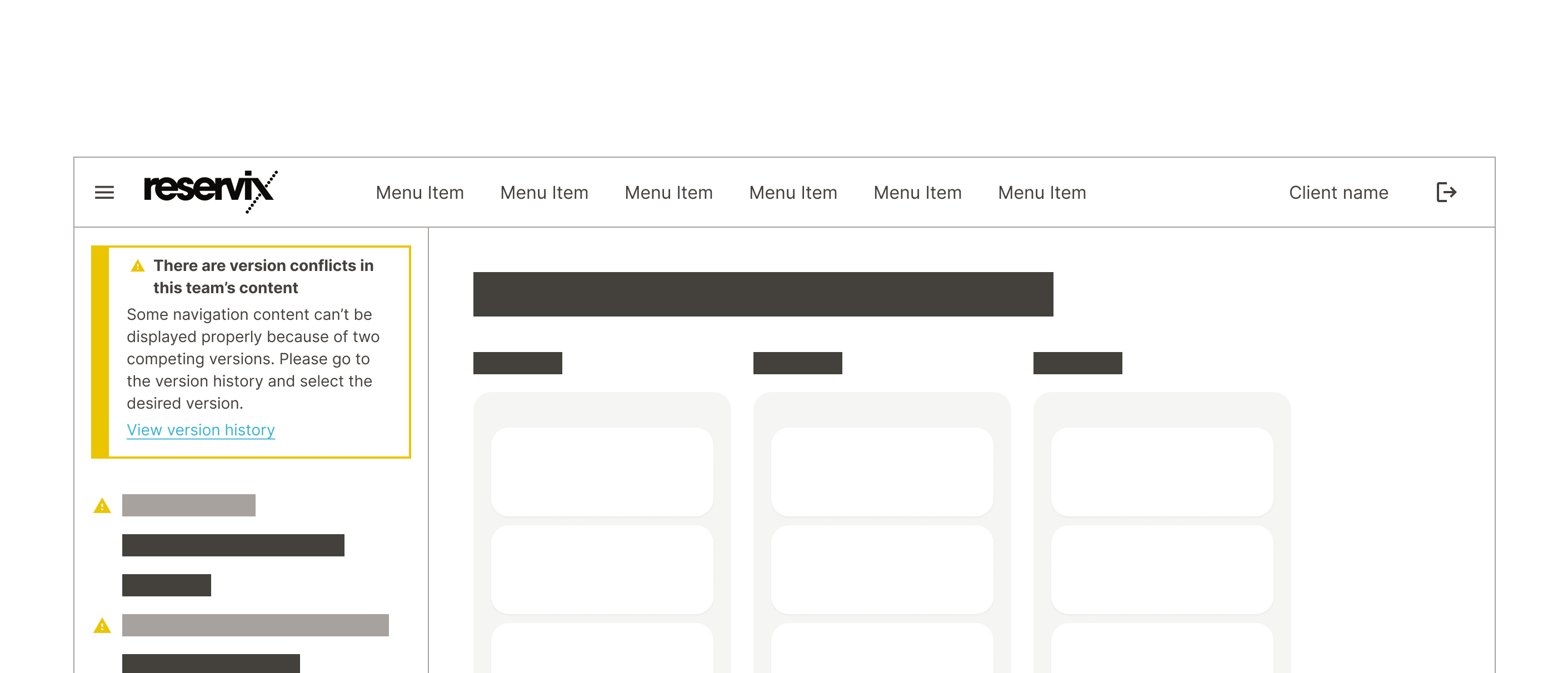
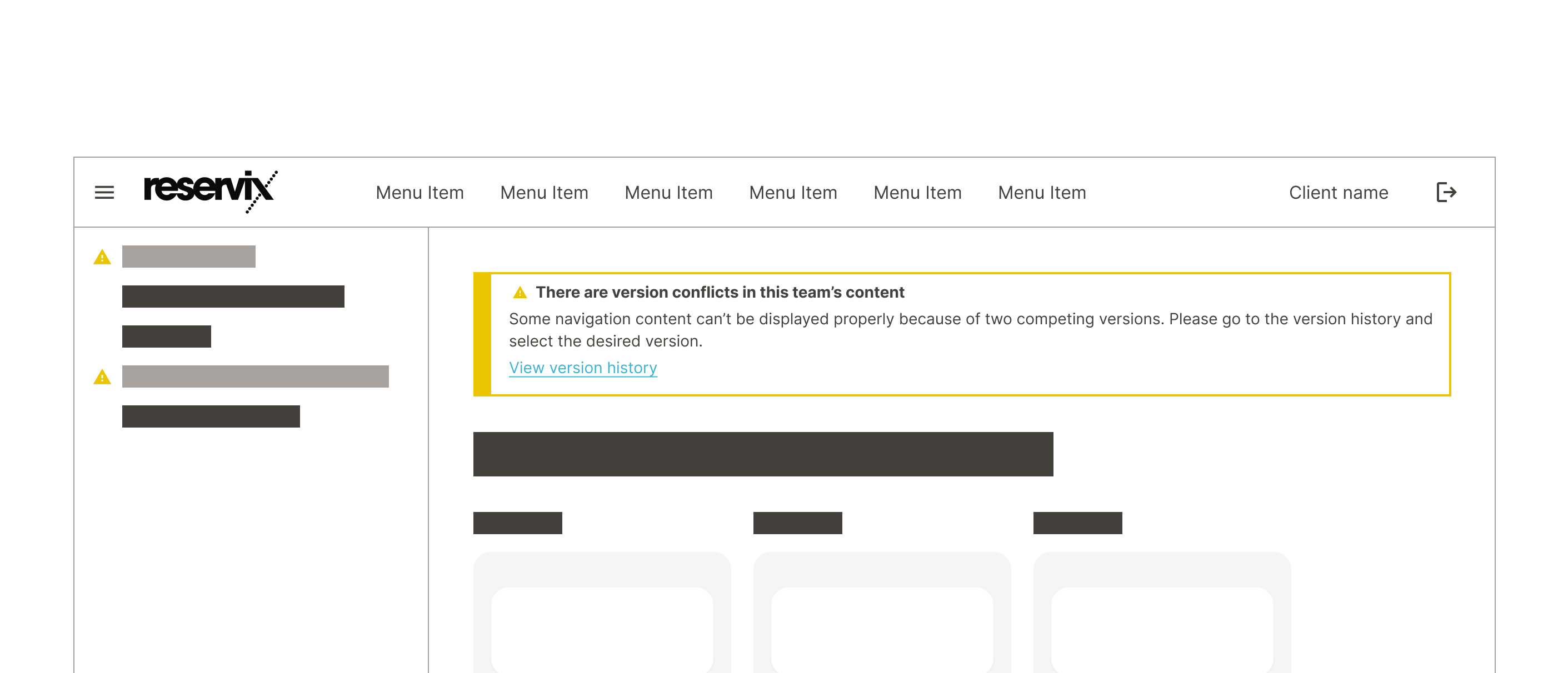
A section message is a block-level component that is used to alert users to something in a specific section of the screen. It is placed near the affected content in a way that clearly communicates its relationship. This is often directly above the affected section or content, but use your best judgement and place it where it makes the most sense in context.
import { Link, SectionMessage, Stack, Text } from '@marigold/components';export default () => ( <SectionMessage> <SectionMessage.Title>This page is read-only</SectionMessage.Title> <SectionMessage.Content> <Text> You don't have permission to edit this page. If you think you should have editing rights, contact your group administrator. </Text> <Stack> <Link>View team roles</Link> <Link>About permission</Link> </Stack> </SectionMessage.Content> </SectionMessage>);
Place section message near the affected content.

Don't place section messages in unaffected sections.
Placement and Appearance
Positioning: Place messages in ways that match their urgency, communicate their relationship to the affected content, and are easy to notice.
Stacking order: Avoid showing multiple simultaneous messages whenever possible. If multiple messages of the same type must be shown simultaneously or in sequence, stack them in descending order of urgency: Error, Warning, Success, Information.
Consistency: Ensure that the color and icon you have chosen match the message you want to convey.
Responsiveness: Ensure messages adapt well to different screen sizes.
User Interaction
Actions: If appropriate, include ways for users to take action, like dismissing, retrying, or navigating to more details.
Persistence: Decide if messages should auto-dismiss after a set time, auto-dismiss after resolution, or remain until dismissed by the user.
Note
Auto-dismiss is not currently implemented in any Marigold components, but will be added in an upcoming release. If your team has built auto-dismissal into a component, consider contributing it to the design system. Send us a Slack message(internal only)
Content Guidelines
Conciseness: Ensure messages are brief and easy to scan.
Clarity: Use human-centered language to explain things, not system jargon.

Helpfulness: Always communicate how the problem can be resolved and what the user should do next to move forward in their experience. Take responsibility and avoid blaming the user.
Tone: Be professional and polite. Match the tone of the message to its purpose.
Punctuation: Don't use end-punctuation in headings. Never use exclamation points.
References
- 10 Usability Heuristics for User Interface Design
- Understanding and fighting alert fatigue (English, German)
- Web Content Accessililty Guidelines (WCAG) 2.0