Filter
Understand methods to refine data.
In many applications, large or complex data sets can be difficult to navigate. Filtering helps users focus on what matters most by narrowing results to meet specific criteria or comparing a smaller subset of items. By removing irrelevant results, filtering improves efficiency and makes workflows smoother.
Anatomy
The filtering pattern in Marigold combines consistent layout with flexible component usage. While the overall structure remains the same, the specific components used can be adapted to the data set and the application's context. This adaptability allows the pattern to support a wide range of use cases while delivering a clear and efficient user experience.
The image below shows the main areas of the pattern, their placement within the layout, and how they work together.

- Filter Panel: The filter panel controls, for example checkboxes, radio buttons and sliders, are shown in a panel that slides in from the right side of the page. While it overlaps part of the content, it does not block the rest of the page, so other content remains visible and interactive. This approach allows filters to be changed without breaking the flow of work, keeping the process quick and seamless.
- Toolbar: The toolbar is positioned above the data set and may include elements such as a search field, sorting options, and a button to open the filter panel. Placing these controls here gives users quick access to actions that refine results without requiring them to scroll.
- Applied Filter: This area lists the filters currently in use, allowing quick review and adjustments. It also offers a single action to clear all filters at once. This gives the user clarity about what is being displayed, prevents confusion, and enables faster refinements.
- Data Set: The data set is the collection of items to which filters are applied. Items that match the filter criteria are displayed, while others are hidden. This area typically takes up most of the layout because it is the primary focus for the user. Depending on the type of data, it can appear as a table or as items arranged in tiles and cards.
- Pagination: Located below the data set, the pagination divides the filtered results into smaller, manageable pages. Placing it here keeps navigation controls close to the content they affect, provides a natural reading flow from the data to the controls, and reduces cognitive load, making it easier to browse large data sets.
Usage
Filters are most valuable when a data set is too large or complex for users to easily scan in its entirety. They become especially useful when multiple parameters or categories can significantly narrow the results. Well-applied filters streamline the process of finding relevant items, reduce information overload, and enable users to complete tasks more efficiently.
Types and Formats
Filters can be presented in several formats depending on the type of data and how users are expected to interact with it. The choice of filter type should reflect the nature of the data, the available space in the interface, and the intended user workflow. Common types include:
| Type | Description | Component |
|---|---|---|
| Single | Allows only one option to be chosen from a set, such as selecting a single category or status. A radio group is typically used, as it makes the one-choice rule clear and supports quick decision-making. | Radio |
| Multiple | Enables users to select several options at once, for example multiple categories or attributes. Checkboxes clearly signal that multiple selections are possible and give instant visual confirmation. | Checkbox |
| Range | Lets users choose values within a continuous range, making it ideal for filtering quantities, prices, or measurements. Sliders provide an intuitive way to adjust values without manual input. | Slider |
| Min/Max | Provides precise control over numeric ranges by allowing exact lower and upper limits to be entered. This is useful when accuracy is important. | NumberField |
| Contains | Filters items based on specific words or phrases entered by the user. This method is valuable for keyword searches or partial matches. | TextField |
Creating Effective Filters
When creating filters, ensure the chosen parameters directly match actual properties or categories in the data set, so it is obvious to the user how their selections change the displayed results. Each filter's purpose should be unambiguous, allowing users to refine results in a precise and efficient way without confusion.
Organize filters in a logical order, such as by most-used, so they are intuitive to find and apply. Use clear, descriptive labels so their purpose is immediately understood. Limit the number of filters to those that provide genuine value, keeping the interface focused, uncluttered, and easy to navigate.
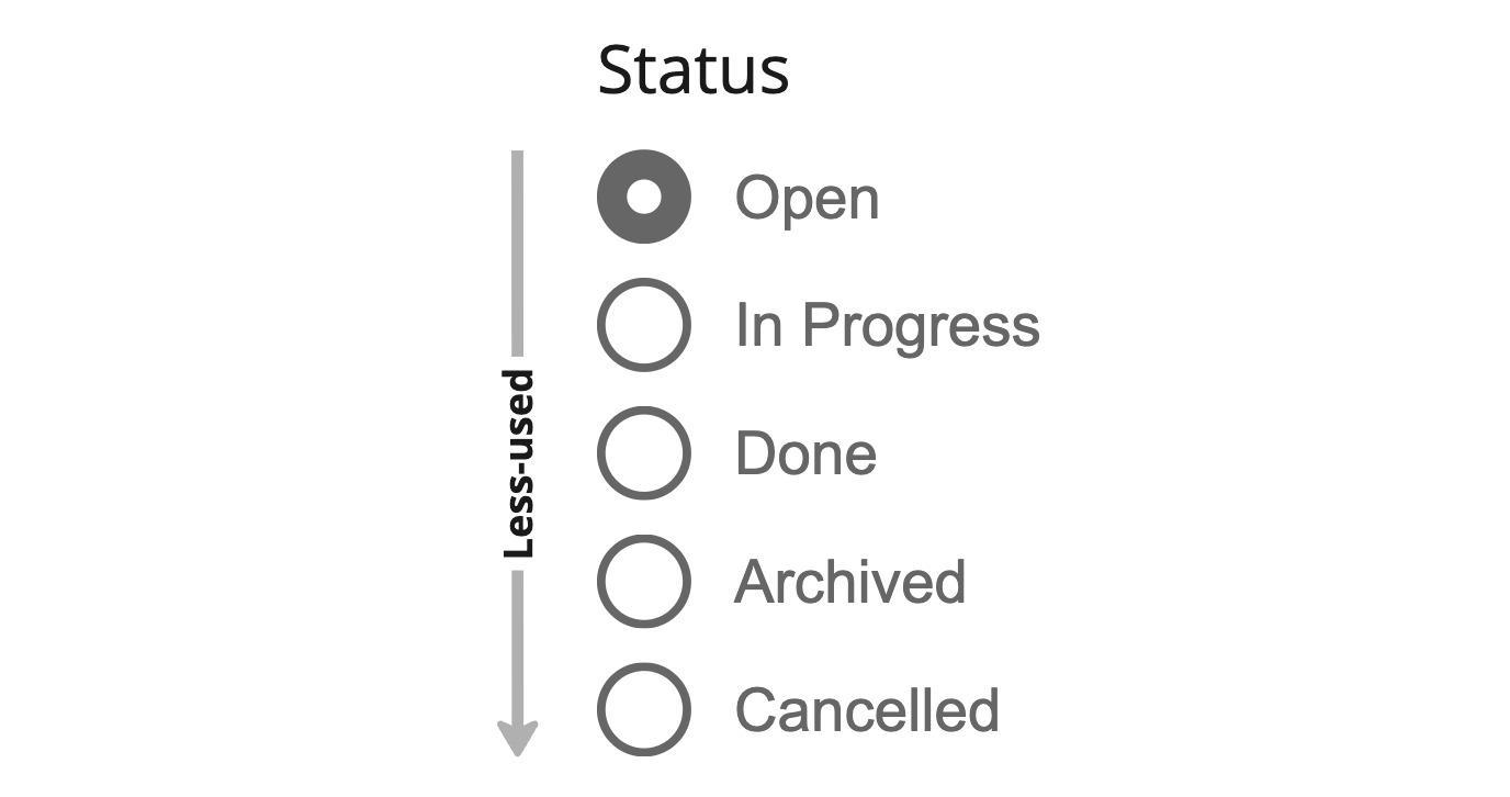
Order filter options by most-used to help users find relevant choices quickly.
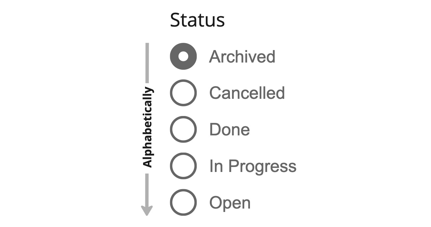
Do not order strictly alphabetically if it buries the most frequently selected options.
Managing Many Options
When a filter offers many possible options, showing them all at once can overwhelm users and make scanning difficult. A better approach is to display only the most relevant or frequently used options first, with a "show more" button to reveal the full list when needed. This keeps the panel compact, easier to read, and still allows full access when required.
import { Checkbox } from '@marigold/components';export default () => ( <Checkbox.Group label="Genre" collapseAt={5} defaultValue={['rock', 'hiphop']} > <Checkbox value="pop" label="Pop" /> <Checkbox value="rock" label="Rock" /> <Checkbox value="hiphop" label="Hip-Hop" /> <Checkbox value="electronic" label="Electronic" /> <Checkbox value="classical" label="Classical" /> <Checkbox value="jazz" label="Jazz" /> <Checkbox value="country" label="Country" /> <Checkbox value="rnb" label="R&B" /> <Checkbox value="metal" label="Metal" /> <Checkbox value="reggae" label="Reggae" /> <Checkbox value="blues" label="Blues" /> <Checkbox value="folk" label="Folk" /> </Checkbox.Group>);Another helpful method is adding a filter filter, which is a small search field within the filter panel. This allows users to quickly locate specific options without scrolling through long lists. Using these techniques together makes it faster and easier to find the right criteria, reducing effort and improving the overall experience.
// TODO: Create a demo. Issue is that this is only possible with a
// `<ListBox>` in RAC currently. but maybe we can do this without
// the `Autocomplete` from RAC?
Showing Option Counts
Displaying counts next to filter options gives users a sense of scale and helps them make informed choices. A category labeled "Concerts (85)" or "Workshops (12)" communicates availability without the user needing to test the filter.
This is particularly helpful in large datasets where the number of matching results can guide prioritization. Counts should update dynamically as filters are applied, so that users can see immediately how their selections affect the result set. Keeping the counts visible ensures transparency and avoids the frustration of selecting filters that return little or no data.
Counts are also useful in single select filters such as those built with radio buttons. Even though only one option can be active at a time, the numbers preview the impact before a choice is made. They also reinforce clarity when a filter is already applied, showing exactly what scope remains.
Whether single select or multi select, pairing counts inside the filter panel with a clear applied filter summary gives users confidence that their selections match their intent.
// TODO: create a demo hereSelect All Options
In multi-select filters, leaving everything unchecked typically means all results are shown, so a "Select all" option is not always required. It becomes valuable in long lists where users often want nearly everything, or when a parent-child structure enables bulk toggling. In these scenarios it reduces effort and makes the common "all except a few" pattern easier to achieve.
When included, "Select all" should appear in the filter header and be paired with a "Clear" control for quick reset. Partial selections can be communicated with an indeterminate parent state. Always display how many items are selected, and use accessible labels that clarify scope, such as "Select all 125 items."
// TODO: create a demo here. also allow our checkbox / listbox to have a "count" feature?Exclude Filters
Exclude filters can be helpful, but they add complexity. They work best when users want nearly everything yet need to remove only a small number of items. In these situations, beginning with all items selected and then deselecting a few creates a natural flow.
This approach produces an "All except" state that is easier to grasp. It makes intent clear in both the filter panel and the summary, reducing long lists of checkmarks while still giving a precise description of what has been excluded.
// TODO: create a demo here. again ... a count feature would be niceBatch Filtering
Batch filtering allows multiple selections to be made across different parameters without instantly updating the results. Instead, the data set is refreshed only when a global "apply" action is triggered. This approach is particularly effective for very large data sets or when the filtering parameters are complex, as it prevents unnecessary refreshes and provides users with more control over when the results update.
Handling Empty States
Empty states occur when no items match the applied filters, often because the criteria are too narrow, the filters conflict with each other, or the data set lacks matching values. This situation should be clearly communicated through the data set area itself, for example by displaying a clear message or visual placeholder where results would normally appear. Doing so helps users quickly understand why no results are shown and guides them toward resolving the issue. Supportive actions can include suggesting broader parameters, offering related content, or providing an easy-to-access "clear filters" control to reset the view and start fresh.
Name | Type | Address | Capacity | Price |
|---|---|---|---|---|
No results found. Try adjusting your search or filters. | ||||
import { Button, EmptyState, Table } from '@marigold/components';const Empty = () => ( <EmptyState title="No results found." description="Try adjusting your search or filters." action={<Button>Clear all filters</Button>} />);export default () => ( <Table aria-label="Empty table"> <Table.Header> <Table.Column rowHeader>Name</Table.Column> <Table.Column>Type</Table.Column> <Table.Column>Address</Table.Column> <Table.Column>Capacity</Table.Column> <Table.Column>Price</Table.Column> </Table.Header> <Table.Body emptyState={Empty}>{[]}</Table.Body> </Table>);An empty state can also occur in the applied filters area when no filters are currently active. Displaying this state helps users understand that no filtering criteria are in place and that all available results are being shown.
import { Tag, Text } from '@marigold/components';export default () => ( <Tag.Group label="Applied Filters" emptyState={() => ( <Text variant="muted" fontSize="sm" fontStyle="italic"> None </Text> )} > {[]} </Tag.Group>);Applied Filter Labels
The recommended approach for applied filter labels is to keep them clear and structured. Combine three parts: the identifier (what is filtered, such as category, property, or type), the relative or absolute operator (how it applies, for example is, is above, is between, or a direct match), and the value (the number, threshold, or date).
For absolute values, pair the filter name with its exact value, for example "Status is Approved", to be concise yet precise. For relative values, add the relative term and exact dates or details, such as "Last 7 days (Aug 3 – Aug 9)", to avoid ambiguity. Use clear operators like "is", "is between", "before", "after", and "in the last" for readability. Symbols (>, =, :) can work in compact or technical views but may be less clear for broad audiences, especially with relative timeframes.
When an applied filter contains a large number of values, avoid grouping them all into a single tag, as this makes scanning and reading difficult and disrupts consistent sizing. Instead, display only the first two or three values, then indicate the number of remaining ones with a clear count, for example "(+7 more)".
import { DateFormat, Inline, Tag } from '@marigold/components';export default () => ( <Tag.Group label="Applied Filters" onRemove={() => {}}> <Tag id="type">Type is Club or Lounge</Tag> <Tag id="date"> <Inline> Next 7 Days ( <DateFormat value={[new Date(), new Date(Date.now() + 7 * 24 * 60 * 60 * 1000)]} /> ) </Inline> </Tag> <Tag id="traits">Traits are cheap, hype (+5 more)</Tag> </Tag.Group>);// TODO: should we make a helps to create these labels? this could also do i18nReverting Filters
When applied filters result in no displayed results, for example when criteria are too restrictive, conflicting, or simply no longer relevant, it is important to offer quick and accessible ways to revert them. This prevents users from becoming stuck or frustrated and allows them to continue exploring the data set with minimal effort.
Two recommendations are:
- Allow the user to remove individual filters directly from the applied filters area, enabling them to quickly discard any selection that is no longer relevant and immediately see the effect on the data set without disrupting other active filters.
- Clear all filters at once using an action in the applied filters area. This instantly resets the filtering state and returns the view to its unfiltered default. It allows the user to remove every active filter in one simple step and immediately restore full visibility of all available data.
Offering both options provides flexibility. Users can make precise adjustments by removing specific filters or start fresh by clearing them all.
import type { Key } from 'react';import { useState } from 'react';import { Button, Stack, Tag, Text } from '@marigold/components';const items = [ { id: 'type', name: 'Type is Club or Lounge', }, { id: 'rating', name: 'Rating is 3 or more', }, { id: 'traits', name: 'Traits are cheap, hype (+5 more)', },] satisfies { id: string; name: string }[];export default () => { const [filter, setFilter] = useState(items); const onRemove = (keys: Set<Key>) => { setFilter(prevItems => prevItems.filter(item => !keys.has(item.id))); }; return ( <Stack space={6} alignX="right"> <Tag.Group label="Applied Filters" items={filter} onRemove={onRemove} removeAll emptyState={() => ( <Text variant="muted" fontSize="sm" fontStyle="italic"> None </Text> )} > {filter.map(item => ( <Tag key={item.id} id={item.id}> {item.name} </Tag> ))} </Tag.Group> <Button size="small" onPress={() => setFilter(items)}> Reset Demo </Button> </Stack> );};"Remove all" Visibility
The "Remove all" action is automatically hidden when only one filter is active, as removing it individually is simpler and cleaner.
Persisting Filters in the URL
Applied filters should be reflected in the URL as query parameters. This means the user can bookmark a filtered view for quick access, return to the same filtered view even after closing the browser, or share it with others by sending the link. With filters included in the URL, the user can also use the browser's forward and backward buttons to move through previous filter states naturally.
This practice allows multiple people to work with the same filtered view, helps preserve the exact context of a search or analysis for later reference, and ensures that users can revisit or share a view with all filters already applied without the need to manually reselect them.
With filters included in the URL, it is also possible to enable the browser's forward and backward buttons to move through previous filter states. Be aware that this can be confusing if filters change too often. It should only be enabled when batch filtering is used and when persistent state recovery is valuable.
Recommendated Library
Use nuqs to manage URL state. This makes it easy to keep filter settings in sync with the address bar and share them between components. By default, query updates replace the current history entry. To make the Back button restore previous states, use the history option.
Demo
// TODO: make the demo more prominent, e.g. by putting a image with a link here- TODO: Can filter controls always be a
<Listbox>with different selectionmodes??? - TODO: Toolbar (from RAC) for the ... toolbar.
- TODO: add a number badge in the sidebar? (or at the filter element, when combined with the applied filters provides a detailed snapshot of what specific filter values are applied to the data set and the relevant parameters that they correspond with)
- TODO: Do we need a strictly technical part or at least a filter need to be part of the URL guideline?