Badge
Component for short notes with one color as status messages
A <Badge> is a content component. This component can be used to reflect status messages via a short note and a color.
Anatomy
It consists of a container and the content can either be a text or an icon.

Appearance
The appearance of a component can be customized using the variant and size props. These props adjust the visual style and dimensions of the component, available values are based on the active theme.
| Property | Type | Description |
|---|---|---|
variant | default | primary | success | warning | info | error | admin | master | The available variants of this component. |
size | - | The available sizes of this component. |
Badges use color to convey meaning at a glance. Choose the variant that matches the semantic intent of the status or label.
| Variant | Description | When to use |
|---|---|---|
default | Neutral badge with a subtle border. This is the default variant. | Labels or metadata without a specific status, like categories, counts, or version numbers. |
primary | Badge in the brand color with high visual weight. | Drawing attention to important labels that don't represent a status, like "Recommended", "Pro", or "Featured". |
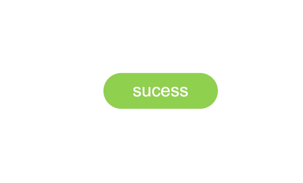
success | Green-tinted badge. | Positive statuses like "Active", "Completed", or "Approved". |
warning | Yellow-tinted badge. | Cautionary statuses like "Pending", "Expiring", or "Needs review". |
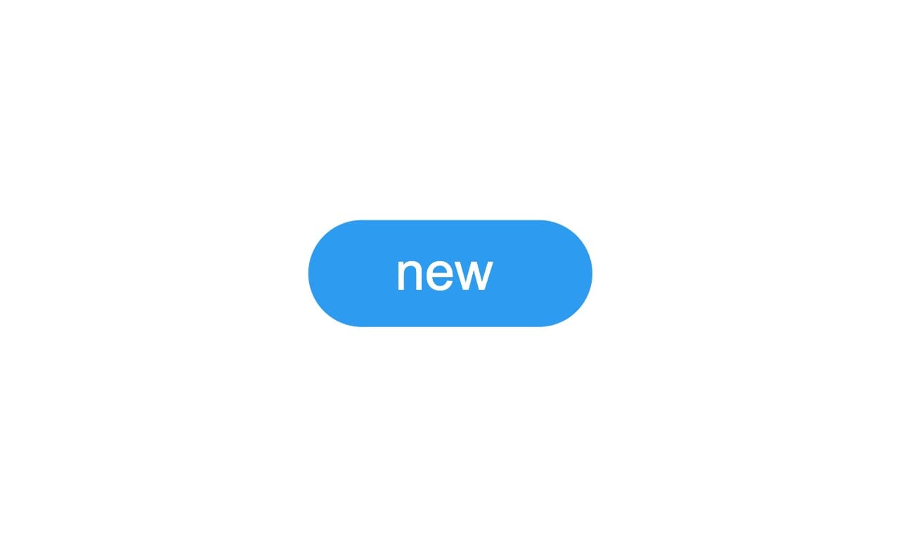
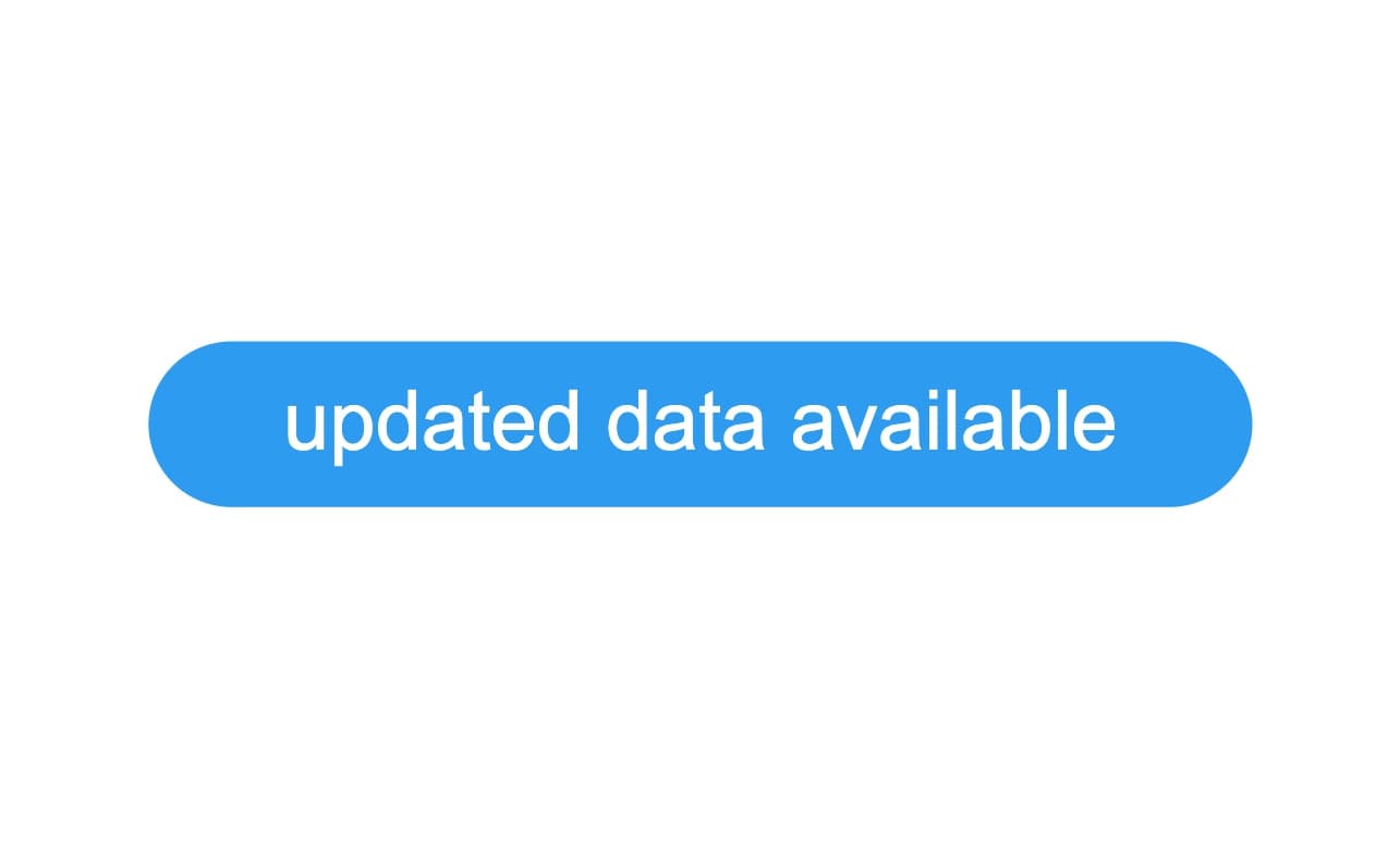
info | Blue-tinted badge. | Informational statuses like "New", "Updated", or "In progress". |
error | Red-tinted badge. | Negative statuses like "Failed", "Rejected", or "Expired". |
admin | Outlined badge with admin-specific color. | Marking content visible only to admin users. Learn more. |
master | Outlined badge with master-specific color. | Marking content visible only to master users. Learn more. |
Usage
A <Badge> is a component used to provide information on new updates and notifications. It is used with other components and cannot be used alone. The content of a badge can be arbitrary, but it is preferred to use a string and/or a icon.
Text Label Length
The Badge is a simple and compact component for use in a limited space in the context of more complex components. When it includes a text label, make sure it fits into the dedicated space.
Do
Don't
Color
As the Badge is used as an indicator, its color must be precise and relevant to the message that the badge conveys.
Do
Use the colors wisely and according to the meaning that the Badge implies.
Don't
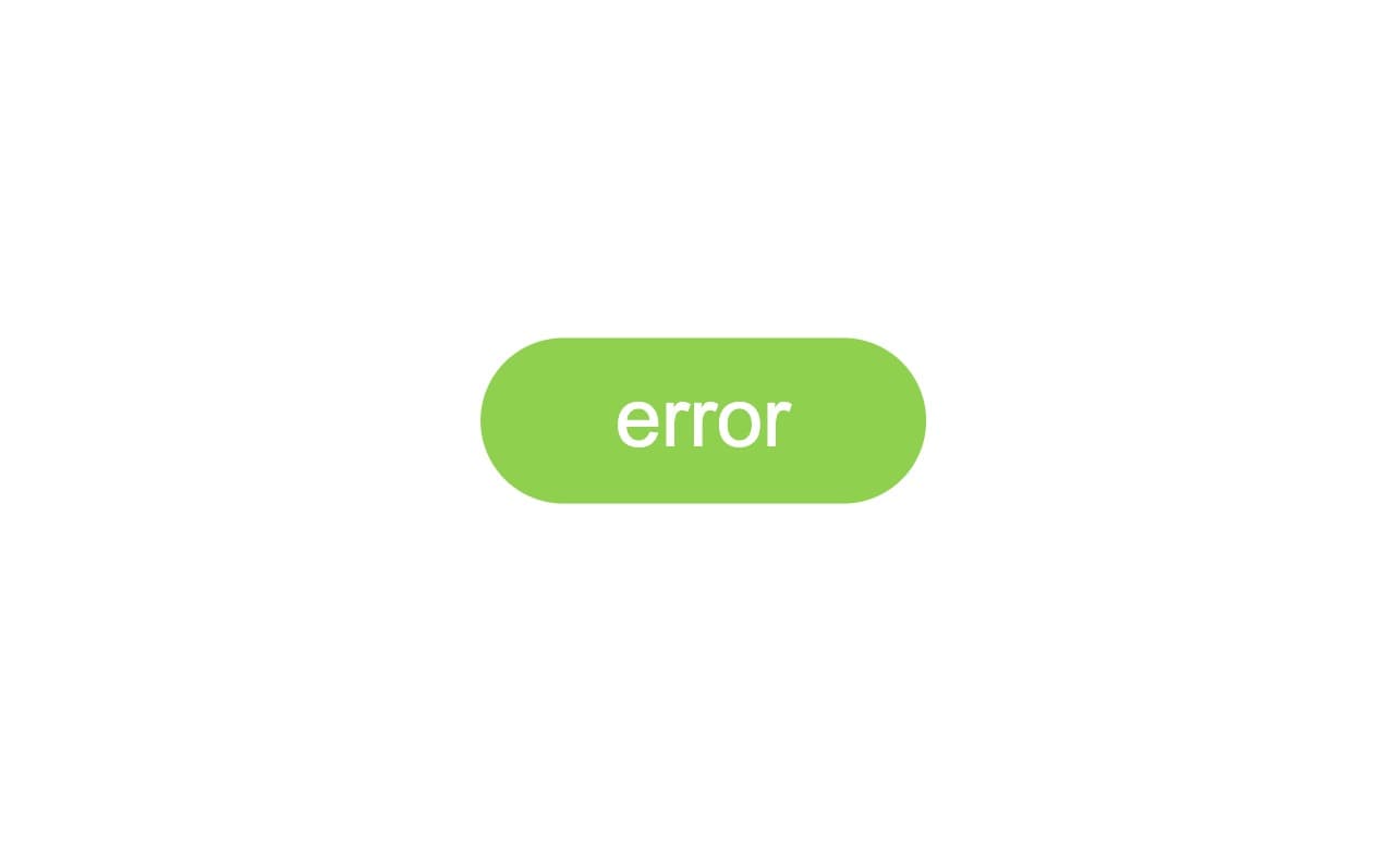
Avoid using arbitrary colors that would not match the message that the Badge conveys.
Props
Badge
Prop
Type