Tag
Used to manage related options.
Tags help users explore, filter, or manage related options in a compact and accessible format. They are arranged in a container where they can be interacted with as a group. Tag groups are commonly used in search interfaces, content management systems, or anywhere users need to explore, refine, or manage categories and topics.
Anatomy
A tag group consists of a group label, a field label, individual tags with tag labels, and optional remove buttons for each tag.

Appearance
The appearance of a component can be customized using the variant and size props. These props adjust the visual style and dimensions of the component, available values are based on the active theme.
| Property | Type | Description |
|---|---|---|
variant | - | The available variants of this component. |
size | - | The available sizes of this component. |
Usage
Tags are best used to help users explore, filter, or manage related options in a clear and compact format. They work well in interfaces where users need to select from a list of categories, refine content through filters, or manage applied labels such as interests, skills, or topics.
Because tags are small, lightweight, and easily scannable, they support quick decision-making and reduce visual noise. Use them when grouping semantically similar items, especially in forms, search experiences, or when summarizing user-defined inputs like selected filters or preferences.
Selection modes
Tag groups support single or multiple selection to match different interaction needs. Use single selection when users need to make a clear and exclusive choice, such as selecting a format or category. Use multiple selection when users are refining results, customizing preferences, or filtering a list based on several criteria.
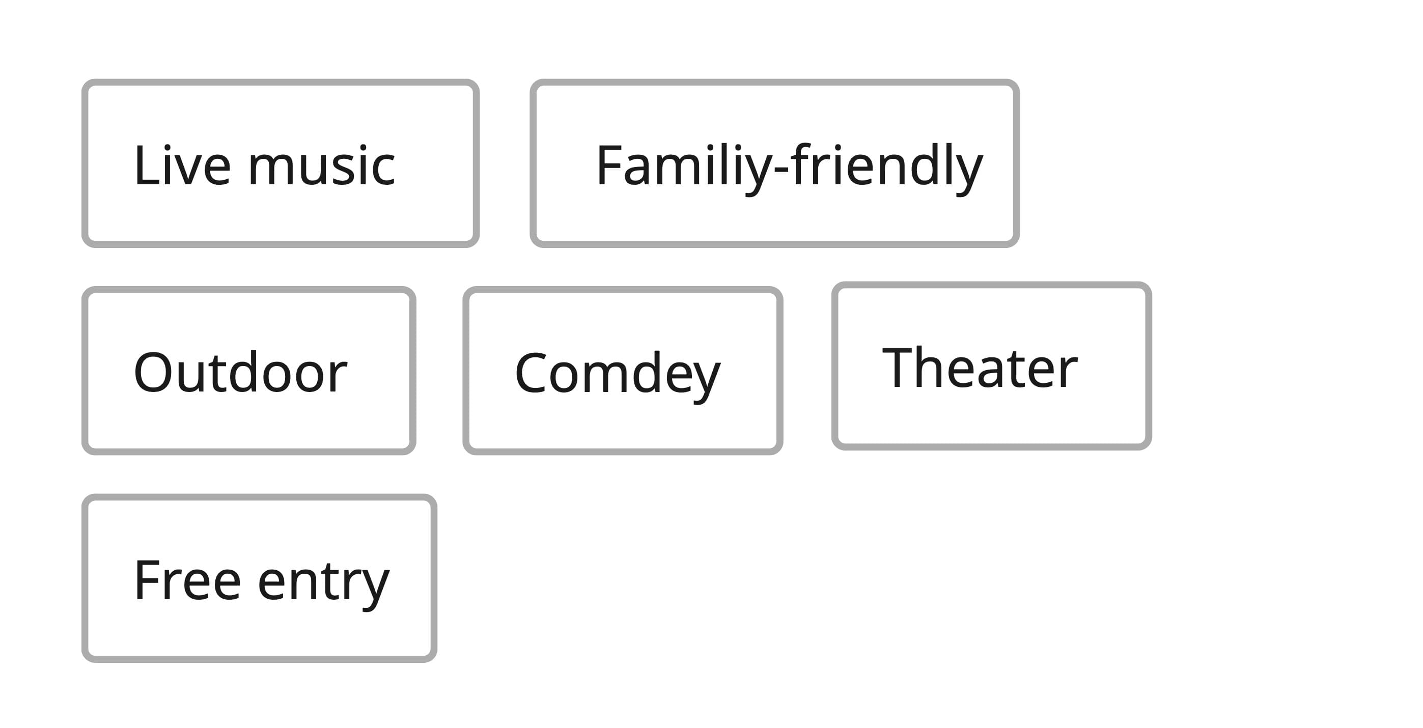
import { Stack, Tag } from '@marigold/components';export default () => ( <Stack space={6}> <Tag.Group label="Ticket type" selectionMode="single" defaultSelectedKeys={['student']} > <Tag id="standard">Standard</Tag> <Tag id="vip">VIP</Tag> <Tag id="student">Student</Tag> <Tag id="senior">Senior</Tag> </Tag.Group> <Tag.Group label="Interests" selectionMode="multiple" defaultSelectedKeys={['theater', 'comedy']} > <Tag id="music">Music</Tag> <Tag id="theater">Theater</Tag> <Tag id="comedy">Comedy</Tag> <Tag id="workshops">Workshops</Tag> <Tag id="food-drink">Food & Drink</Tag> </Tag.Group> </Stack>);Content and labeling
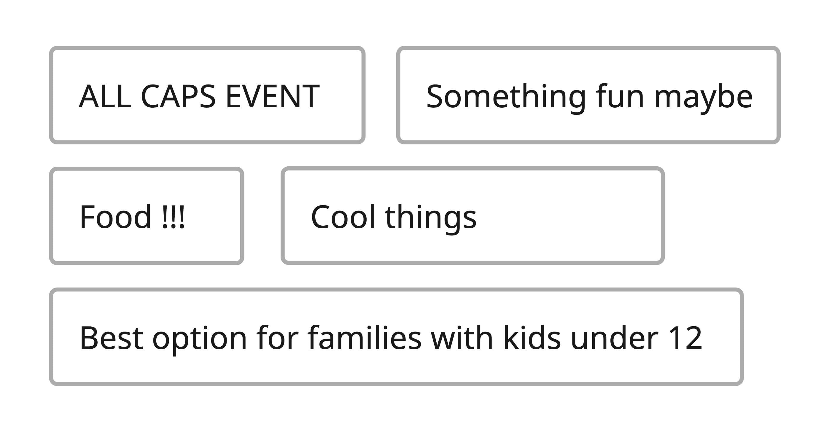
Tag labels should be concise, typically under 20 characters, to keep them easily scannable and prevent visual clutter. Keep the total number of tags manageable, generally no more than 8 to 10 at once, to avoid overwhelming users.
Use sentence case and avoid unnecessary words or filler to maintain a consistent and clear labeling style. Each tag should be descriptive and specific to avoid ambiguity and help users quickly understand the meaning or purpose of the tag in context.
Do
Use labels that are short, specific, and consistently formatted.
Don't
Avoid inconsistent casing, vague or lengthy labels, and hard-to-scan text.
Interactive vs static
Tags should not be used to display the status of an object or to highlight newly added content, as these are static indicators that do not require user interaction. Use the badge component instead.
Tags are interactive elements intended for selection, filtering, or removal, whereas badges are static indicators meant to convey status or highlight new or updated items. Use badges when the information should be visible but not acted upon, and tags when the user needs to interact with or manage the content.
Removable tags
Removable tags are ideal when users need to manage selected filters, categories, or input tokens. Use them when the tag represents user-generated or user-controlled content that may need to be revised or undone.
import { useState } from 'react';import { Tag, Text } from '@marigold/components';const emptyState = () => ( <Text fontSize="sm" color="muted-foreground" fontStyle="italic"> No filters selected. </Text>);export default () => { const [filters, setFilters] = useState([ { id: 1, label: 'Category: Live music' }, { id: 2, label: 'Location: Berlin' }, { id: 3, label: 'Date: This weekend' }, { id: 4, label: 'Setting: Outdoor' }, ]); const removeFilter = (keys: Set<number>) => { setFilters(prev => prev.filter(filter => !keys.has(filter.id))); }; return ( <Tag.Group label="Applied filters" onRemove={removeFilter} emptyState={emptyState} > {filters.map(({ id, label }) => ( <Tag key={id} id={id}> {label} </Tag> ))} </Tag.Group> );};In addition to removing individual tags, you can also provide an option to remove all tags at once. This is especially useful when users want to quickly clear all selected filters or categories with a single action, improving efficiency and user experience.
import { useState } from 'react';import { Tag, Text } from '@marigold/components';const emptyState = () => ( <Text fontSize="sm" color="muted-foreground" fontStyle="italic"> No filters selected. </Text>);export default () => { const [filters, setFilters] = useState([ { id: 1, label: 'Category: Live music' }, { id: 2, label: 'Location: Berlin' }, { id: 3, label: 'Date: This weekend' }, { id: 4, label: 'Setting: Outdoor' }, ]); const removeFilter = (keys: Set<number>) => { setFilters(prev => prev.filter(filter => !keys.has(filter.id))); }; return ( <Tag.Group label="Applied filters" onRemove={removeFilter} removeAll emptyState={emptyState} > {filters.map(({ id, label }) => ( <Tag key={id} id={id}> {label} </Tag> ))} </Tag.Group> );};Props
Tag
Prop
Type
DOM event handlers (63)
Prop
Type
Tag.Group
Prop
Type
Accessibility props (4)
Prop
Type
DOM event handlers (64)
Prop
Type
Alternative components
Badge: Small indicator often used to show a status, count, or notification on another UI element. It is not interactive like a Tag and used for highlighting statuses.
Checkbox: Used when users need to select one or more options from a list in a form-like setting. Better suited than tags for structured input fields where persistent visibility of all choices is important.
Radio: Ideal for mutually exclusive choices, especially in forms or settings. Prefer over tags when the focus is on making a single clear decision with labeled options.
Select: Suitable for selecting one or more options from a longer or dynamic list. Use instead of tags when space is limited or when the list of options is too long to display at once.