List
Used to display an unordered or ordered list.
The <List> component is a content component used to display a list of items. It is versatile and can be used for both unordered and ordered lists, making it suitable for various content presentation needs.
The list is divided into two parts: <List> and <List.Item>.
By default, the application displays an unordered (ul) list. However, this list can also be displayed as an ordered (ol) list.
Anatomy
The <List> component consists of the following parts:

Appearance
The appearance of a component can be customized using the variant and size props. These props adjust the visual style and dimensions of the component, available values are based on the active theme.
- The Screaming Pixels
- Echo Mirage
- Orchestra Obscura
- DrumForge
- Velvet Static
| Property | Type | Description |
|---|---|---|
variant | - | The available variants of this component. |
size | default | small | The available sizes of this component. |
Usage
The List component is used to display a group of related items in a consistent and accessible way. It supports both unordered (bulleted) and ordered (numbered) formats and can be customized through nesting. List components are ideal for organizing content such as tasks, steps, features, or grouped data while maintaining design consistency and readability across the application.
Do
Use two or more items in a list to provide meaningful content.
Don't
Avoid using a list with only one item, as it does not provide meaningful grouping or context.
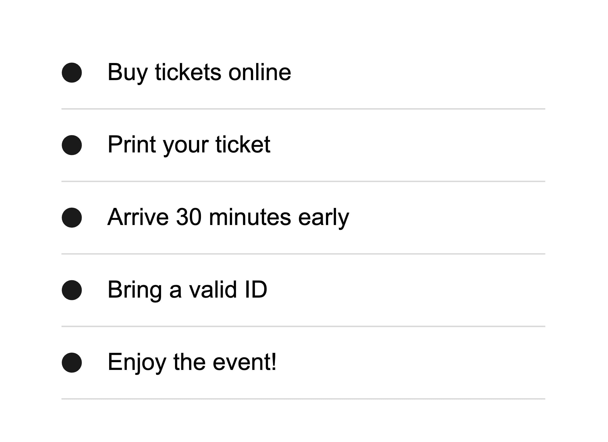
Unordered list
Per default, the <List> component renders an unordered list. Unordered lists are best used for grouping items that do not require a specific order, such as features, options, or general information. They help users quickly scan and understand related items without implying a sequence.
Ordered list
Ordered lists are best used when the sequence of items matters, such as for step-by-step instructions, processes, timelines, or ranked priorities. They help users follow a specific flow and improve accessibility by clearly communicating order to screen readers. Use them for actions that must be completed in order or when numbering adds meaning, avoid them when the item order is irrelevant.
You can use the as prop to change the list type from unordered to ordered.
- Log in to your account.
- Navigate to the "My Tickets" section.
- Select the event you’ve purchased.
- Click on "Download Ticket".
- Show the ticket at the venue entrance.
import { List } from '@marigold/components';export default () => ( <div className="p-4"> <List as="ol"> <List.Item>Log in to your account.</List.Item> <List.Item>Navigate to the "My Tickets" section.</List.Item> <List.Item>Select the event you’ve purchased.</List.Item> <List.Item>Click on "Download Ticket".</List.Item> <List.Item>Show the ticket at the venue entrance.</List.Item> </List> </div>);Nested Unordered List
Nested lists allow you to represent hierarchical relationships or group related items under a common parent. Each level of nesting is typically indented to visually communicate its position in the structure. This helps users understand which items are primary and which are subordinate.
Upcoming Concerts
- The Screaming Pixels – "Neon Nights Tour"
- 📍 Hamburg – Neon Dome – July 22, 2025
- 📍 Berlin – Electric Arena – July 25, 2025
- 📍 Stuttgart – Soundhall – July 28, 2025
- Orchestra Obscura – "Moonlight Symphonies"
- 📍 Leipzig – Royal Hall – August 18, 2025
- 📍 Dresden – Opera House – August 20, 2025
- Velvet Static – "Jazz Revival Sessions"
- 📍 Munich – Blue Note Club – September 9, 2025
- 📍 Cologne – Smooth Vibes Bar – September 11, 2025
- 📍 Frankfurt – Lounge 88 – September 13, 2025
import { Headline, List } from '@marigold/components';export default () => ( <div className="p-4"> <Headline level="3">Upcoming Concerts</Headline> <List> <List.Item> The Screaming Pixels – "Neon Nights Tour" <List> <List.Item>📍 Hamburg – Neon Dome – July 22, 2025</List.Item> <List.Item>📍 Berlin – Electric Arena – July 25, 2025</List.Item> <List.Item>📍 Stuttgart – Soundhall – July 28, 2025</List.Item> </List> </List.Item> <List.Item> Orchestra Obscura – "Moonlight Symphonies" <List> <List.Item>📍 Leipzig – Royal Hall – August 18, 2025</List.Item> <List.Item>📍 Dresden – Opera House – August 20, 2025</List.Item> </List> </List.Item> <List.Item> Velvet Static – "Jazz Revival Sessions" <List> <List.Item>📍 Munich – Blue Note Club – September 9, 2025</List.Item> <List.Item> 📍 Cologne – Smooth Vibes Bar – September 11, 2025 </List.Item> <List.Item>📍 Frankfurt – Lounge 88 – September 13, 2025</List.Item> </List> </List.Item> </List> </div>);Props
List
Prop
Type
List.Item
Prop
Type
Alternative components
Stack: Lists should be used for content and not for layout purposes. If you need accessible lists for layout, consider using the
<Stack>component withasListproperty instead.