ContextualHelp
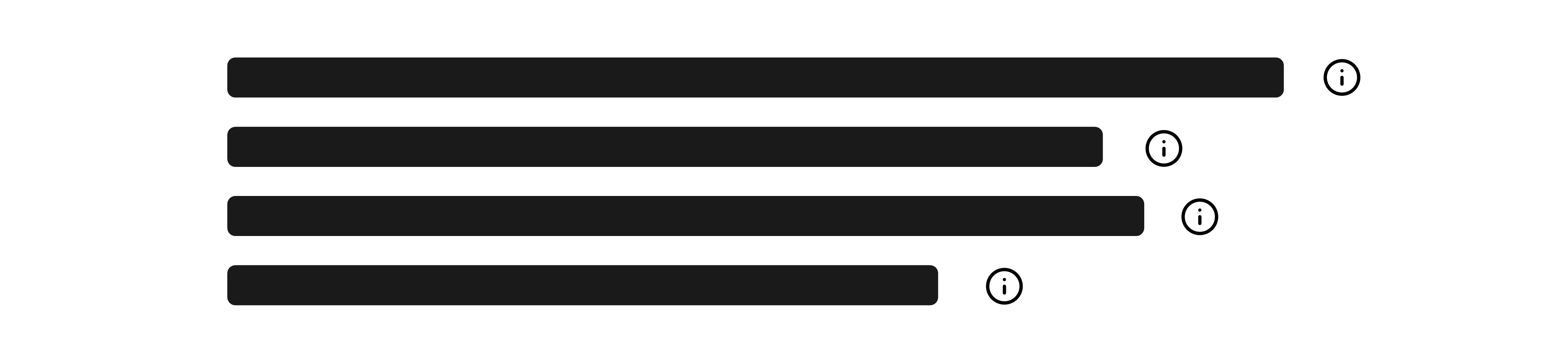
The <ContextualHelp> component provides inline assistance to help users understand specific parts of your interface. It displays a small button with an icon that, when clicked, opens a popover with explanatory content. This content can be rich and interactive, unlike tooltips which are intended for brief, passive messages.
Use <ContextualHelp> when users might need deeper guidance or context, especially for complex settings, form inputs, or unfamiliar actions.
Anatomy
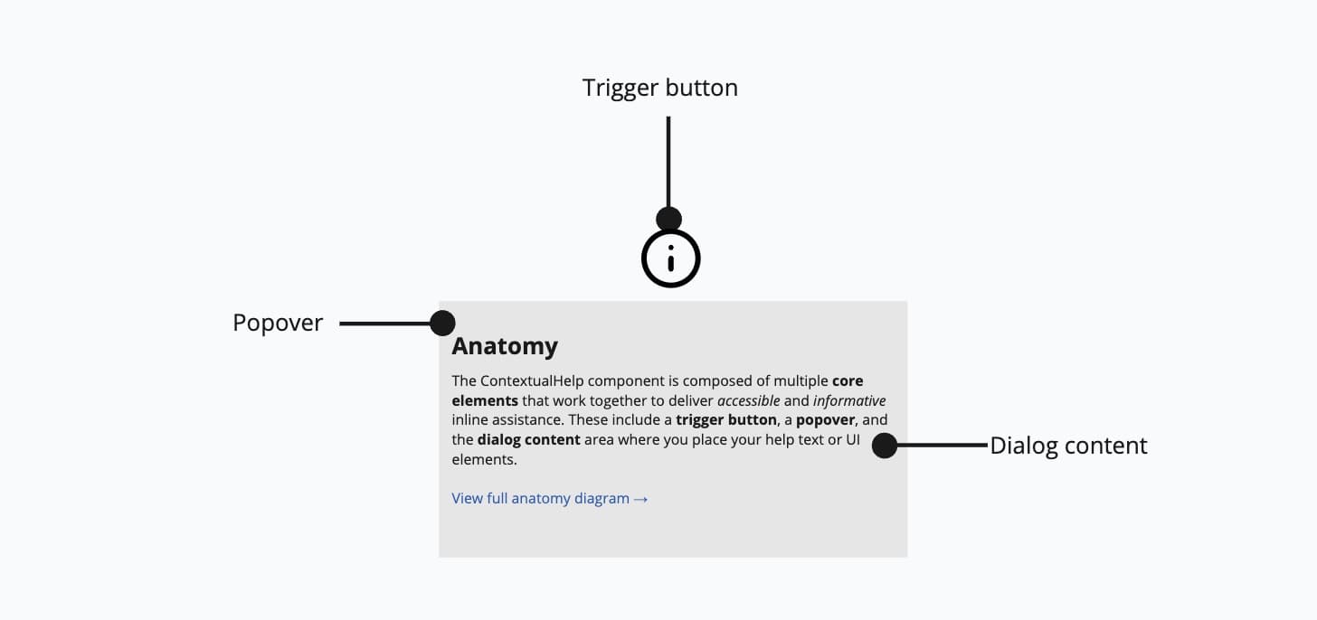
- Trigger button: A small icon button that activates the help popover.
- Popover: A floating container for detailed help content.
- Dialog content: Custom content area that may contain headings, paragraphs, or even interactive elements.
Appearance
The appearance of a component can be customized using the variant and size props. These props adjust the visual style and dimensions of the component, available values are based on the active theme.
Usage
ContextualHelp is ideal when brief tooltips are insufficient and users might benefit from more elaborate information. Avoid overusing it—too many help popovers can clutter the UI. Use tooltips for short, simple hints (e.g., labeling an icon), and reserve ContextualHelp for situations where users need deeper guidance or clarification. Aim to use it selectively on parts of your app where extra support truly adds value.

Use contextual help for fields that users frequently misunderstand.
Don't use contextual help for obvious or self-explanatory features.
Custom placement
The position of the popover can be customized using the placement prop. Available options include top, bottom, left, right, and aligned variants like bottom start.
Interactive content
Unlike tooltips, ContextualHelp supports complex and interactive content inside the popover—such as links, buttons, or structured text.
Props
childrenReactNode;
defaultOpen?boolean;
offset?number;
onOpenChange?(isOpen: boolean) => void;
open?boolean;
placement?Placement;
ref?Ref<HTMLInputElement>;
ref.current to null
(or call the ref with null if you passed a callback ref).
@see {@link https://react.dev/learn/referencing-values-with-refs#refs-and-the-dom React Docs}width?WidthProp;