ContextualHelp
Displays contextual help via popover on button click
The <ContextualHelp> component provides inline assistance to help users understand specific parts of your interface. It displays a small button with an icon that, when clicked, opens a popover with explanatory content. This content can be rich and interactive, unlike tooltips which are intended for brief, passive messages.
Use <ContextualHelp> when users might need deeper guidance or context, especially for complex settings, form inputs, or unfamiliar actions.
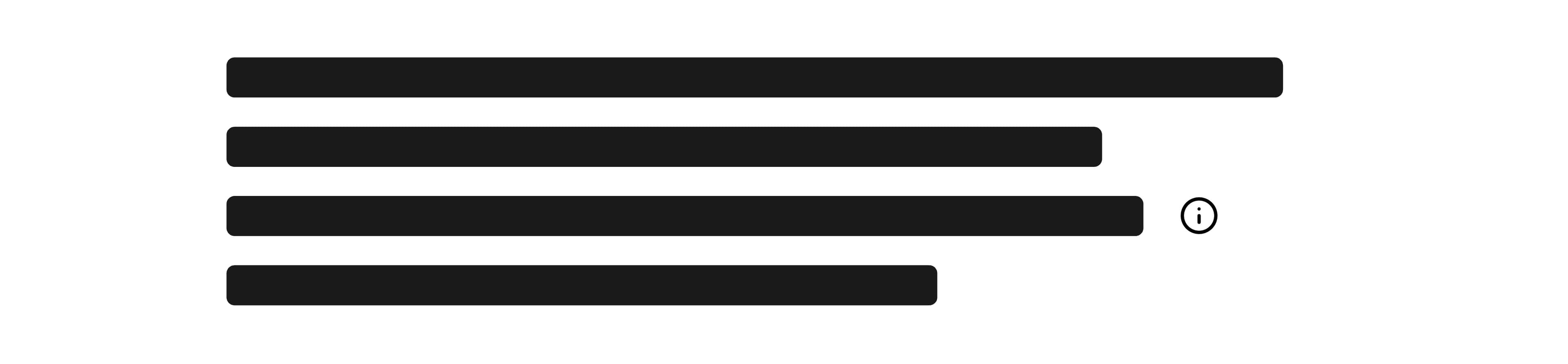
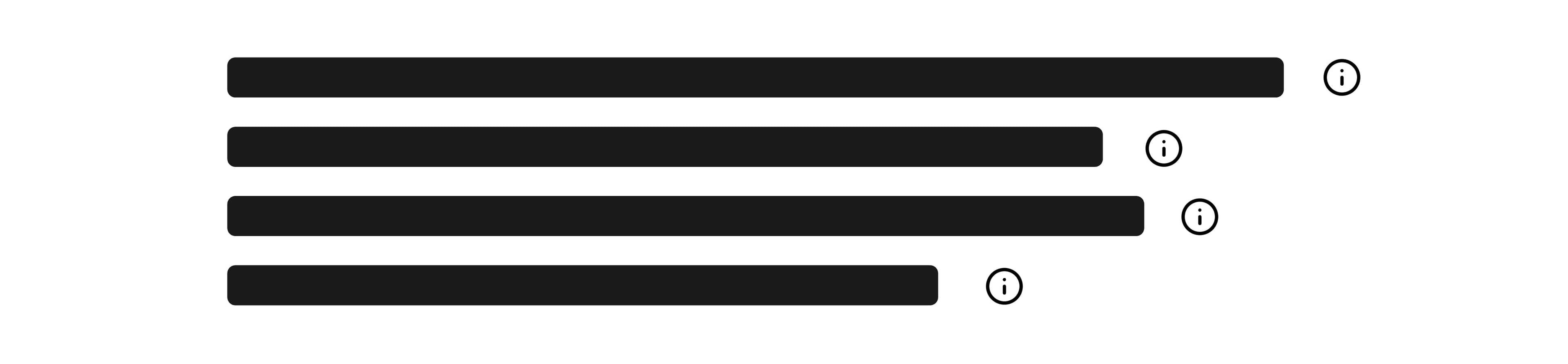
Anatomy

- Trigger button: A small icon button that activates the help popover.
- Popover: A floating container for detailed help content.
- Dialog content: Custom content area that may contain headings, paragraphs, or even interactive elements.
Appearance
The appearance of a component can be customized using the variant and size props. These props adjust the visual style and dimensions of the component, available values are based on the active theme.
Usage
ContextualHelp is ideal when brief tooltips are insufficient and users might benefit from more elaborate information. Avoid overusing it—too many help popovers can clutter the UI. Use tooltips for short, simple hints (e.g., labeling an icon), and reserve ContextualHelp for situations where users need deeper guidance or clarification. Aim to use it selectively on parts of your app where extra support truly adds value.
Do
Use contextual help for fields that users frequently misunderstand.
Don't
Don't use contextual help for obvious or self-explanatory features.
With form fields
ContextualHelp can be placed directly next to form field labels to provide additional context or guidance for specific inputs. This is particularly useful when:
- Explaining format requirements: Help users understand expected input patterns (e.g., email formats, phone number conventions, or date formats).
- Clarifying technical terms: Provide definitions for industry-specific jargon or unfamiliar concepts without cluttering the label itself.
- Offering examples: Show sample values or scenarios to guide users toward correct input.
- Explaining data usage: Inform users why certain information is needed or how it will be used, especially for sensitive data.
Keep labels concise and use ContextualHelp to elaborate. This keeps your form clean while ensuring users can access detailed guidance when needed. Place the help icon immediately after the label text to maintain a clear visual relationship between the field and its explanation.
import { ContextualHelp, Link, TextField } from '@marigold/components';export default () => ( <TextField label={ <span className="flex items-center gap-1"> Email <ContextualHelp offset={2}> <ContextualHelp.Title>Email Format</ContextualHelp.Title> <ContextualHelp.Content> Please enter a valid email address in the format: user@example.com <br /> <Link href="https://www.marigold-ui.io/components/overview?theme=rui"> Learn more </Link> </ContextualHelp.Content> </ContextualHelp> </span> } type="email" description="We'll never share your email" width="fit" />);Custom placement
The position of the popover can be customized using the placement prop. Available options include top, bottom, left, right, and aligned variants like bottom start.
'use client';import { ContextualHelp } from '@marigold/components';export default () => ( <div className="flex flex-wrap gap-6"> <ContextualHelp placement="top">Top Placement</ContextualHelp> <ContextualHelp placement="bottom">Bottom Placement</ContextualHelp> <ContextualHelp placement="left">Left Placement</ContextualHelp> <ContextualHelp placement="right">Right Placement</ContextualHelp> <ContextualHelp placement="bottom start">Bottom Start</ContextualHelp> </div>);Interactive content
Unlike tooltips, ContextualHelp supports complex and interactive content inside the popover—such as links, buttons, or structured text.
'use client';import { Button, ContextualHelp, Inline, Stack, Text,} from '@marigold/components';export default () => ( <ContextualHelp> <ContextualHelp.Title>Need more help?</ContextualHelp.Title> <ContextualHelp.Content> <Stack space={2}> <Text> You can access detailed documentation or contact our support. </Text> <Inline space={2}> <Button variant="ghost">Docs</Button> <Button>Support</Button> </Inline> </Stack> </ContextualHelp.Content> </ContextualHelp>);Props
ContextualHelp
Prop
Type