Button
Buttons allow users to trigger actions.
The <Button> component is a crucial components of any user interface, allowing users to initiate actions such as submitting forms, adding items to a cart, or opening dialogs. The label on a button indicates the action that will be taken when the user presses it.
Different types of buttons, such as primary and secondary, help guide users by visually prioritizing actions. Primary buttons are typically used for the most important actions, while secondary buttons provide less critical options.
Anatomy
A button consists of a pressable area, often containing a textual label or icon, which users can press or activate using the Space or Enter keys.

Appearance
The appearance of a component can be customized using the variant and size props. These props adjust the visual style and dimensions of the component, available values are based on the active theme.
| Property | Type | Description |
|---|---|---|
variant | primary | secondary | ghost | destructive | destructive-ghost | link | The available variants of this component. |
size | default | small | large | icon | The available sizes of this component. |
The Button component provides different visual styles to establish hierarchy and communicate intent.
| Variant | Description | When to use |
|---|---|---|
primary | High-contrast, filled button that draws attention. | The most important action on a page or section, such as "Save" or "Submit". There should only be one primary button per page or section. |
secondary | Neutral button with a subtle border. This is the default variant. | Supporting actions that complement the primary action, like "Cancel" or "Back". |
ghost | Transparent button with no border or background. | Low-emphasis actions that should be available but not visually prominent, like toolbar actions. |
destructive | Red filled button signaling a dangerous action. | Primary destructive actions with significant consequences, like "Delete permanently". |
destructive-ghost | Red text with no background. | Destructive actions that are not the primary focus of the current view, like a "Remove" button on individual list items. |
link | Styled as an inline text link. | Actions that should blend into surrounding text while remaining interactive. |
Usage
Buttons have a wide range of applications. Their most common usage is to submit forms, but they are also used for other actions like opening a <Menu> or <Dialog>.
It is essential that the label and context around the button clearly set expectations for what will happen when the user interacts with it. In user interfaces, buttons guide interactions, providing clear call-to-action elements that help users navigate and complete tasks.
Do
Write button text that is clear, starts with a verb, and helps users confidently take action.
Do
Visual hierarchy
This primary button should represent the most crucial action within that section. Having multiple primary buttons in one section can create confusion and visual clutter, as they compete for the user's attention and detract from the clarity of the intended action.
For how this hierarchy applies to a form's actions, see Action hierarchy in the Forms pattern.
Do
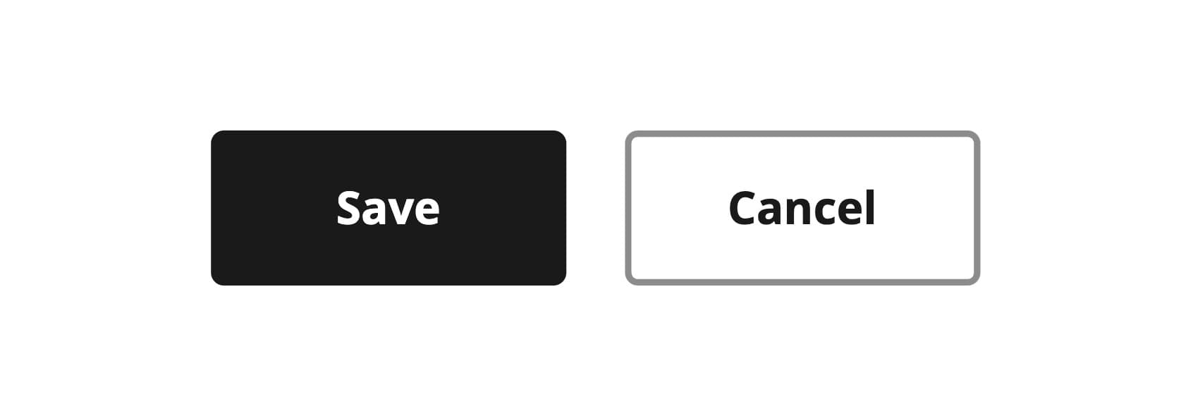
Use one primary button per page or section to highlight the most important action
Don't
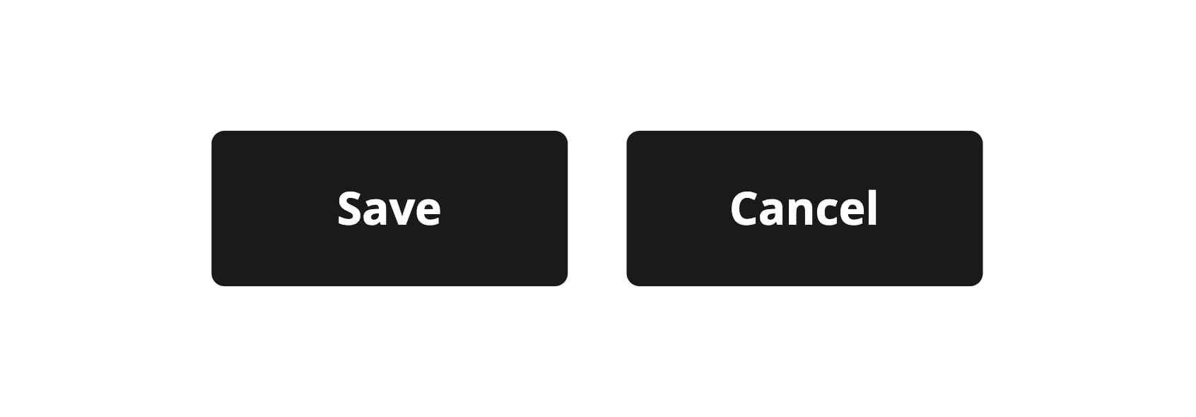
Don't include multiple primary buttons in the same section to prevent confusion and visual clutter.
Placement and order
Depending on where buttons are used, it is advisable to place them appropriately and in the correct order.
-
on full size pages buttons should be aligned from left to right means using the variants from primary → secondary → ghost
-
on dialogs, drawers, toasts or even wizards buttons should be aligned from right to left, also using the variants from primary → secondary → ghost
Navigation
When using actions to navigate away from the page you should use the <LinkButton> or the <Link> component.
<Link> has no ghost variant - use secondary instead.
Icons and labels
Icons can reinforce text labels, but they can also cause confusion if they don't clearly match the related text. Buttons should always have a label unless they use an icon that is universally understood and accessible.
Accompany labels with icons only when they have a strong association with the text, never use icon purely for decoration.
Icon-only buttons should only be used when the icon is universally recognized and its function is clear without additional text, like a pencil for editing. These buttons are particularly useful in compact spaces or mobile interfaces where screen real estate is limited.
import { Button, Inline } from '@marigold/components';import { Edit } from '@marigold/icons';export default () => ( <Inline space={5} alignY="center" alignX="center"> <Button variant="primary">Edit</Button> <Button variant="primary"> <Edit size={16} /> Edit </Button> <Button variant="icon" aria-label="Edit"> <Edit /> </Button> </Inline>);Keep it accessible
For icon-only buttons, ensure you set an aria-label or aria-labelledby
attribute to provide context and maintain accessibility.
Do
Use icons in buttons to provide additional clarity when the icon is highly relevant to the action.
Don't
Destructive buttons
Destructive buttons are reserved for actions that carry significant and often irreversible consequences, such as permanently deleting data, formatting storage, or performing actions that are difficult to undo. They must be visually distinct to immediately signal to the user the potential impact of their decision.
In Marigold, we offer two dedicated visual variants for implementing destructive actions:
| Variant | Prominence | Use Case |
|---|---|---|
| destructive | High | Use for the primary destructive action within a context, such as the "Delete Permanently" button in a final confirmation dialog. Use sparingly to avoid overwhelming users with too many high-risk options. |
| destructive-ghost | Low | Use for secondary destructive actions, particularly when the main action in the current view is non-destructive (e.g., a small "Delete" button on an item in a list view). |
import { Button, Inline } from '@marigold/components';export default () => ( <Inline space={5} alignY="center" alignX="center"> <Button variant="destructive">Delete</Button> <Button variant="destructive-ghost">Delete</Button> </Inline>);Avoid disabled buttons
A disabled button can't be actioned. Keep buttons active and use validation and error messages to guide users on what needs to be done to proceed.
Disabled buttons are problematic as they offer no feedback on why an action is unavailable, are often hard to see due to low contrast, and are inaccessible to keyboard users who cannot focus on them.
Do
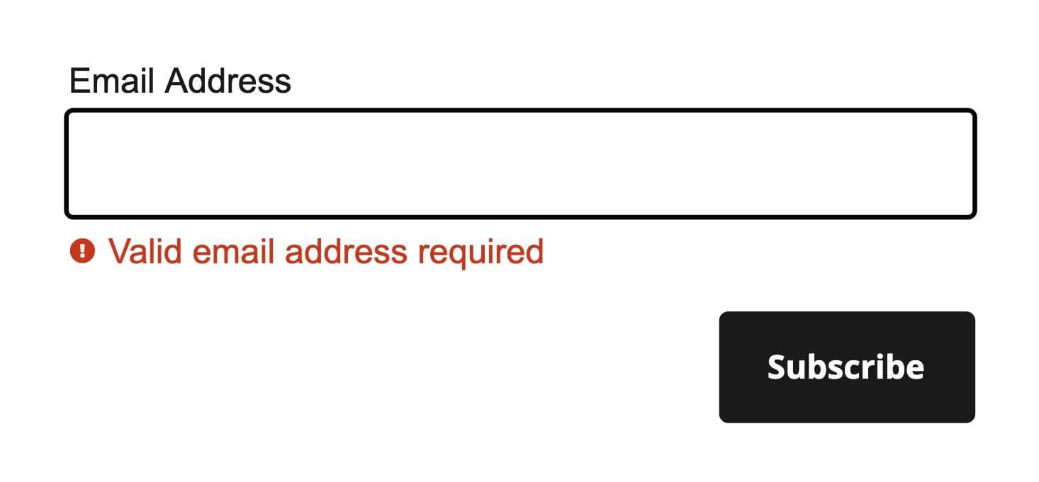
Use validation and error messages to guide users on the necessary steps.
Don't
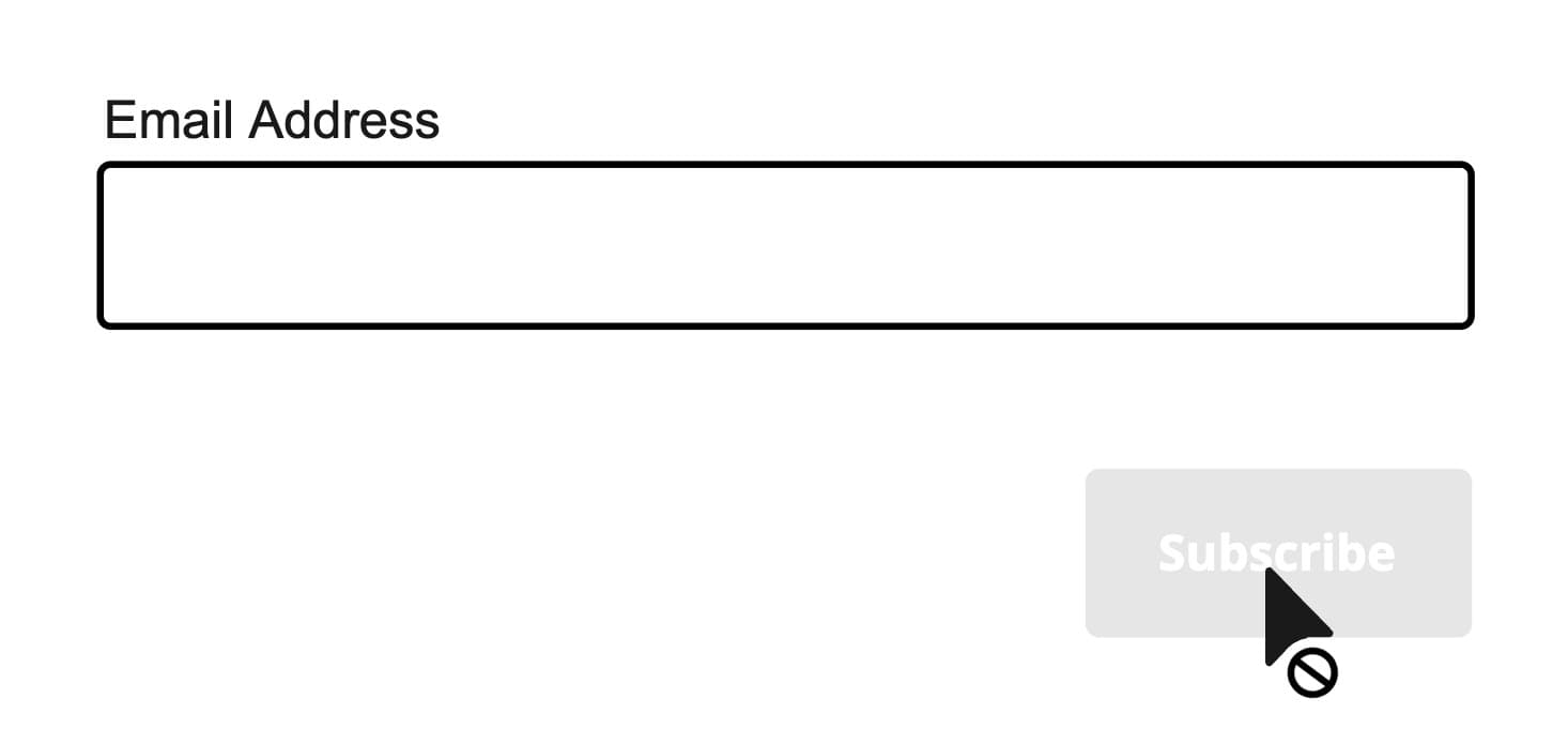
Don't disable form submission buttons, as this doesn't clearly guide users on how to proceed.
In general, it's best to avoid using disabled buttons. However, if they are necessary, take steps to make them more inclusive. Ensure users don't get stuck by providing additional information. Place a message near the disabled button that explains why it is unavailable and what actions are needed to enable it.
import { Button, Stack, Text } from '@marigold/components';export default () => ( <Stack space={1} alignX="left"> <Button disabled>Add discount code</Button> <Text color="text-base-disabled" fontSize="xs"> Only Fanclub members can add a discount code. If you're a Fanclub member, please log in first. </Text> </Stack>);Never put tooltips on disabled buttons
Tooltips aren't accessible on all devices or by some assistive technologies, and they should never be used on non-interactive elements. For more information see the tooltip page.
Loading state
The <Button> component includes a loading property that can be used to display loading behavior. This visually indicates the progress of system operations, such as downloading, uploading, or processing tasks. The loading spinner always shows an indeterminate progress to signify that the duration of the operation is unknown.
This functionality is especially useful when performing actions like submitting a form or saving changes in your application that require time to complete a request. While the button is in the loading state, it becomes disabled, preventing further interaction until the operation is completed.
The button's label should clearly describe the action being performed, providing context for the current state of the process, like also mentioned in Icons and labels.
When the loading state is activated, the label becomes hidden. To ensure accessibility, we provide the loading state with an aria-label and aria-busy.
The loading property must be added manually to a Button, and is intended for processes that typically last more than 1 second.
import { useState } from 'react';import { Button, Inline } from '@marigold/components';export default () => { const [loading, setLoading] = useState<boolean>(false); const handleLoading = async () => { setLoading(true); try { await new Promise<void>(resolve => setTimeout(resolve, 7000)); } finally { setLoading(false); } }; return ( <Inline space={4}> <Button variant="primary" onPress={() => handleLoading()} loading={loading} > Save </Button> </Inline> );};Do
Use the loading prop on the action button to show progress, so the
indicator stays on the button that triggered the action.
Don't
Don't place a separate <Loader> next to a button or swap the label for a
loader manually. Use the built-in loading prop instead.
Pending state from async actions
When the loading state comes from a React 19 action, let useActionState
manage the pending flag and pass it to the button. See Async forms and
useActionState
hook.
Full-width
Full-width buttons are especially useful for emphasizing primary actions like submitting a form or completing a purchase, as they attract attention and create a strong visual hierarchy. They also enhance usability on mobile devices or in narrow layouts by providing a larger, easier-to-tap target.
import { Button } from '@marigold/components';export default () => ( <Button variant="primary" fullWidth> Proceed to checkout </Button>);Button or link
If the user interacts with the element and it results in navigation to another page without submitting a form, use an anchor element (<Link> or <LinkButton>). For all other interactions that perform actions on the same page, use a button (<Button>).
Understanding this distinction is crucial: anchors handle navigation, while buttons handle page-specific actions. Misusing them can cause accessibility and usability issues, as anchors support tab-opening and navigation, while buttons do not.
To visually imitate a button element that navigates (e.g., a "Cancel" action that redirects users to the previous page), use the <ButtonLink> component with the corresponding variant, usually the default secondary. This way, the action is clear and prominent while keeping its navigation function.
import { Button, Inline, LinkButton } from '@marigold/components';export default () => ( <Inline space={2} alignY="center" alignX="center"> <Button variant="primary">Save</Button> <LinkButton href="#">Cancel</LinkButton> </Inline>);Do
Don't
Don't use buttons for navigation purposes.
Press Event
The <Button> component supports user interactions via mouse, keyboard, and touch, handled through the onPress prop. This prop is similar to the standard onClick event but is normalized for all interaction methods. Additionally, onPressStart, onPressEnd, and onPressChange events are fired during user interaction.
Each handler receives a PressEvent, providing details about the target and the type of event that triggered the interaction, like the pointer (mouse, keyboard or touch) that was used.
import { useState } from 'react';import { Button, Stack, Text } from '@marigold/components';export default () => { const [pointerType, setPointerType] = useState(''); const [count, setCount] = useState(0); return ( <Stack space={3} alignX="left"> <Button variant="primary" onPress={() => setCount(count + 1)} onPressStart={e => setPointerType(e.pointerType)} onPressEnd={() => setPointerType('')} > Press me </Button> <Text> Number of times pressed: {count} ( {pointerType ? `Button is pressed via ${pointerType}.` : 'Button not pressed.'} ) </Text> </Stack> );};Props
Prop
Type
Accessibility props (10)
Prop
Type
DOM event handlers (63)
Prop
Type
Alternative components
- Link: A component to navigate to another page.
- LinkButton: A component to navigate to another page but looks like a button.