ToggleButton
An action button that retains an active state.
Use <ToggleButton> in toolbars, editors, and interactive surfaces, where the user presses it to turn a function on or off and the button's appearance reflects the current state. Common examples are formatting actions like bold or italic, canvas options like showing a grid, or favoriting an item.
<ToggleButton> is not a form field or a filter. It has no label, description, error message, or validation state. Reach for Checkbox, Radio, or Switch when you need a form field, and use a <Checkbox.Group> for filtering.
<ToggleButton.Group> is a toolbar of independent on/off actions, not a selection control. Each button in the group toggles on its own, like formatting options, view options, or visible layers. When exactly one option must be selected at a time, switching a view, mode, or filter, use a SegmentedControl instead.
Anatomy
ToggleButton: A toggle button consists of a pressable area containing a label (text, icon, or both) that visually changes to reflect its selected or unselected state.
ToggleButton.Group: A toggle button group is a horizontal container that merges individual toggle buttons into a unified, pill-shaped control. The group removes inner borders and rounds only the outer edges, visually connecting the buttons as a single unit.
Appearance
The appearance of a component can be customized using the variant and size props. These props adjust the visual style and dimensions of the component, available values are based on the active theme.
| Property | Type | Description |
|---|---|---|
variant | - | The available variants of this component. |
size | default | small | icon | The available sizes of this component. |
The ToggleButton component comes in different sizes to fit various contexts.
| Size | Description | When to use |
|---|---|---|
default | Standard button with text label and padding. | General purpose toggle actions with text labels. |
small | Compact button with reduced padding and smaller text. | Space-constrained areas like secondary toolbars. |
icon | Square button sized for a single icon, without text padding. | Toolbars and compact controls where icons alone communicate the action. |
Usage
A toggle button is an action-first control that retains state as a consequence of the action. The user presses it to activate or deactivate a function, and the button's appearance reflects whether that function is currently on or off.
Choose a toggle button when the control should look and behave like a button, the state change takes effect immediately, and the context is an interactive surface rather than a form or settings panel.
Do
Use ToggleButton in toolbars, editors, and canvases for actions where the pressed state is the outcome, like bold formatting or showing a grid.
Do
Provide an aria-label on every icon-only toggle and on the surrounding
<ToggleButton.Group> so assistive technologies announce the toolbar's
purpose.
Don't
Don't use ToggleButton.Group for a single, mutually exclusive choice. Use a SegmentedControl to switch a view, mode, or filter, or a Radio.Group for a choice in a form.
Don't
Don't use ToggleButton as a form filter or any other field that needs a label, description, or validation. Use a Checkbox.Group instead.
Don't
Don't use ToggleButton for settings or preferences that take effect immediately. Use a Switch instead.
Don't
Don't use ToggleButton.Group for switching between views or pages. Use Tabs when navigation is involved.
Standalone toggle
A single <ToggleButton> is suitable for binary actions where the pressed state is the outcome. The button's visual state reflects whether it is currently active or not. Common examples include favoriting an item, bookmarking a page, or pinning a message.
Use the selected and onChange props to control the toggle state. In the example below, each card has a heart toggle that lets users mark venues as favorites.

Main Street Park Amphitheater

Shakytown Comedy Club
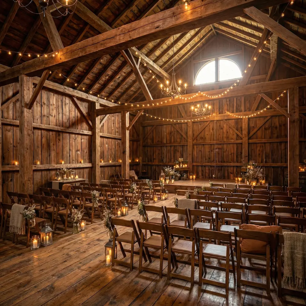
Oak Ridge Barn
Toolbar of toggles
When several related on/off actions belong together, wrap them in a <ToggleButton.Group>. The group merges the buttons into a single visual unit, but each button toggles independently. Use selectionMode="multiple" so any combination of buttons can be active at the same time.
A toggle button group is a toolbar of independent actions, not a selection control. Typical uses are formatting toolbars in a text editor, view options on a canvas, or visibility toggles for layers. The visual grouping signals that the actions are related, while each button still behaves like its own switch.
Use the icon size when the action can be communicated through an icon alone. Add a <Tooltip> to help sighted users understand the action, and always provide an aria-label for screen readers.
A toggle group works equally well with text labels when icons would be ambiguous, for example when toggling view options on a canvas.
Keep it accessible
Icon-only toggle buttons must have an aria-label to communicate their
purpose to screen readers. A tooltip alone is not sufficient since it is not
accessible on all devices or by some assistive technologies.
Disabled state
Toggle buttons support a disabled prop to prevent interaction. You can disable individual buttons or an entire group.
Use disabled states when an option is temporarily unavailable due to the current context, for example when a certain capability is not supported for the selected content type, or when a feature requires a higher subscription plan. Avoid disabling buttons without providing a reason. Users should be able to understand why an option is not available.
Props
ToggleButton
Prop
Type
Accessibility props (9)
Prop
Type
DOM event handlers (63)
Prop
Type
ToggleButton.Group
Prop
Type
Accessibility props (4)
Prop
Type
DOM event handlers (64)
Prop
Type
Alternative components
- SegmentedControl: Use when exactly one option must always be selected from a small set, such as switching a view, mode, or filter in place.
- Checkbox: Use when selecting options within a form that requires a label, description, validation, or submission.
- Switch: Use when toggling a setting or preference on/off with immediate effect.
- Tabs: Use when switching between views that involve navigation.
- Button: Use when the action is one-off and does not hold persistent state.